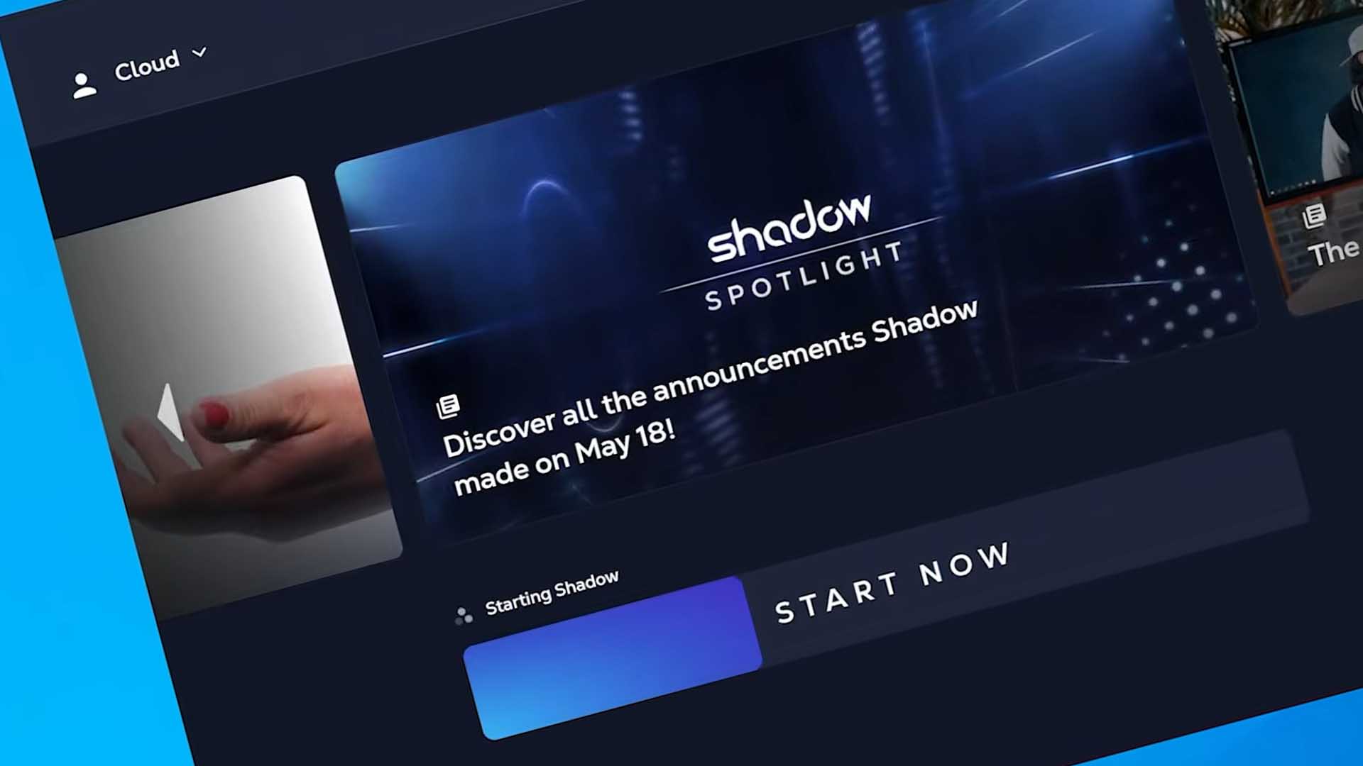
Shadow just launched their new look for their Shadow app. Is it any different? Let’s take a quick look.
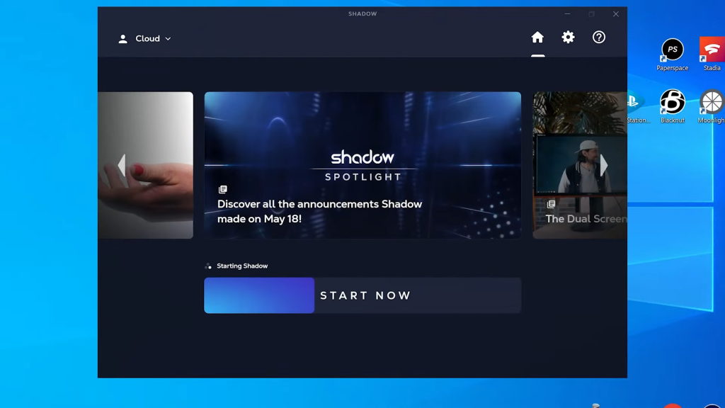
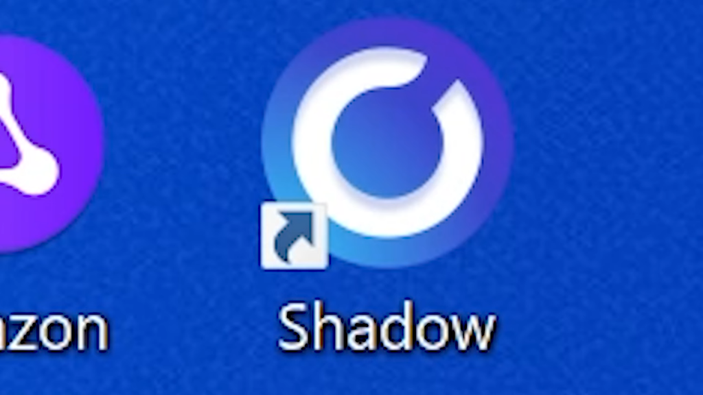
On load, the only real differences are the branding aspects. Fonts are different along with the colors. Nothing has really changed in terms of functionality of the app itself. You’ll also get a different icon on the desktop.
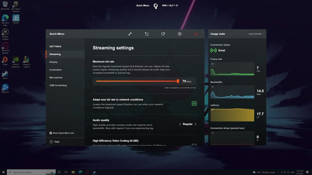
When you login, the Quick Menu logo has changed but everything else on the menu is still in old colors. This will probably be changed in a later updated.
Please note that this is only on the desktop app. The other apps have not changed yet.
Let us know what you think in the comments below. Also to keep on top of everything Shadow, make sure to subscribe and keep locked right here at the only place where you can do battle in gaming heaven – Cloud Gaming Battle.

